Nuxt UI theme
Make Nuxt UI's own components follow the newt/ui tokens, so UButton and a newt/ui Button sit side by side in one look.
Nuxt UI has the general-purpose components: tables,
forms, calendars, overlays. newt/ui has the chat-shaped ones: messages, embeds,
member lists. A project that uses both should not look like two libraries, and
this theme is what joins them. It restyles Nuxt UI’s components from the
--newt-* tokens, so they follow the same colours, radius and font as every
newt/ui component, in both palettes.
It is one registry item, nuxt-ui-theme. Like everything else here it is
copied into your project and is yours to edit: there is no package to depend
on and no module option to learn.
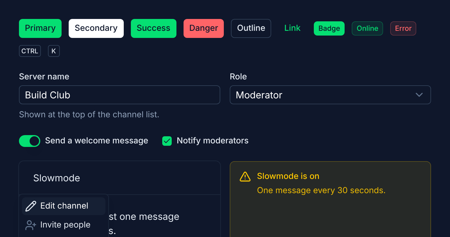
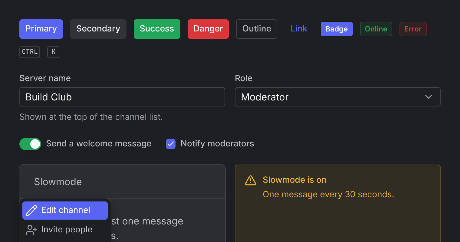
The first image is Nuxt UI as it installs. The second is the same page after the three steps below, with nothing changed in the page itself.
Install
It needs a Nuxt project with Nuxt UI
4 or later and newt/ui initialised, which is what
puts the --newt-* tokens in your stylesheet.
Add the theme
npx newtui@latest add nuxt-ui-themenpx shadcn-vue@latest add @newtui/nuxt-ui-themepnpm dlx newtui@latest add nuxt-ui-themepnpm dlx shadcn-vue@latest add @newtui/nuxt-ui-themeyarn dlx newtui@latest add nuxt-ui-themeyarn dlx shadcn-vue@latest add @newtui/nuxt-ui-themebunx newtui@latest add nuxt-ui-themebunx shadcn-vue@latest add @newtui/nuxt-ui-themedeno run -A npm:newtui@latest add nuxt-ui-themedeno run -A npm:shadcn-vue@latest add @newtui/nuxt-ui-themevlx newtui@latest add nuxt-ui-themevlx shadcn-vue@latest add @newtui/nuxt-ui-themevp dlx newtui@latest add nuxt-ui-themevp dlx shadcn-vue@latest add @newtui/nuxt-ui-themenubx newtui@latest add nuxt-ui-themenubx shadcn-vue@latest add @newtui/nuxt-ui-themenlx newtui@latest add nuxt-ui-themenlx shadcn-vue@latest add @newtui/nuxt-ui-themeupx newtui@latest add nuxt-ui-themeupx shadcn-vue@latest add @newtui/nuxt-ui-theme- newtui
- shadcn
- npm
- pnpm
- yarn
- bun
- deno
- vlt
- vp
- nub
- ni
- upm
The shadcn CLI needs the @newtui registry in your components.json. Set it up.
It writes app/lib/nuxt-ui.ts, and appends a block of --ui-* variables to
the stylesheet named in components.json.
Hand it to Nuxt UI
import { newtNuxtUi } from "~/lib/nuxt-ui"

export default defineAppConfig({
  ui: newtNuxtUi,
})
Let the two share a colour mode
Nuxt UI switches palette with a light or dark class; newt/ui reads a
data-newt-theme attribute. One line makes the colour mode set both, so the
toggle you already have moves both libraries:
export default defineNuxtConfig({
  colorMode: { dataValue: "newt-theme" },
})What it changes
The theme has two layers, and most of the work is done by the first.
The variables. Nuxt UI draws its colours, its levels of text and surface,
its borders and its radius from --ui-* custom properties. The appended block
points each of them at the token that plays the same part:
| Nuxt UI | newt/ui |
|---|---|
--ui-primary |
--newt-brand |
--ui-success, --ui-warning |
--newt-online, --newt-idle |
--ui-error |
--newt-danger |
--ui-info, --ui-secondary |
--newt-text-link |
--ui-bg, -muted, -elevated |
--newt-bg-base, -surface, -elevated |
--ui-text-highlighted, --ui-text |
--newt-text-primary, --newt-text-secondary |
--ui-text-muted, -dimmed |
--newt-text-muted |
--ui-border |
--newt-border |
--ui-radius |
from --newt-radius-sm |
--font-sans, --font-mono |
--newt-font-sans, --newt-font-mono |
That alone recolours every Nuxt UI component, including the ones this page never mentions.
The component overrides. newtNuxtUi then adjusts the components whose
newt/ui counterpart differs in more than colour:
| Component | What changes |
|---|---|
UButton |
Brand hover and active shades; the neutral button is a raised surface, not inverted. |
UInput, UTextarea, USelect |
The input surface, a hairline border and the 4px control radius. |
USelectMenu, USelect options |
The highlighted row is the brand colour with white text. |
UDropdownMenu, UContextMenu |
A floating panel; rows light up in the brand colour. |
UPopover, UTooltip, UToast |
The floating surface and the high elevation shadow; the tooltip is always dark. |
UModal, USlideover |
A raised panel over a black scrim, with a darker footer strip. |
USwitch |
Green when on. |
UCard, UAlert, UBadge, UKbd |
Surface and radius. |
Because every value in both layers is a token, overriding --newt-brand, or
applying a preset, restyles Nuxt UI along with newt/ui.
Light palette
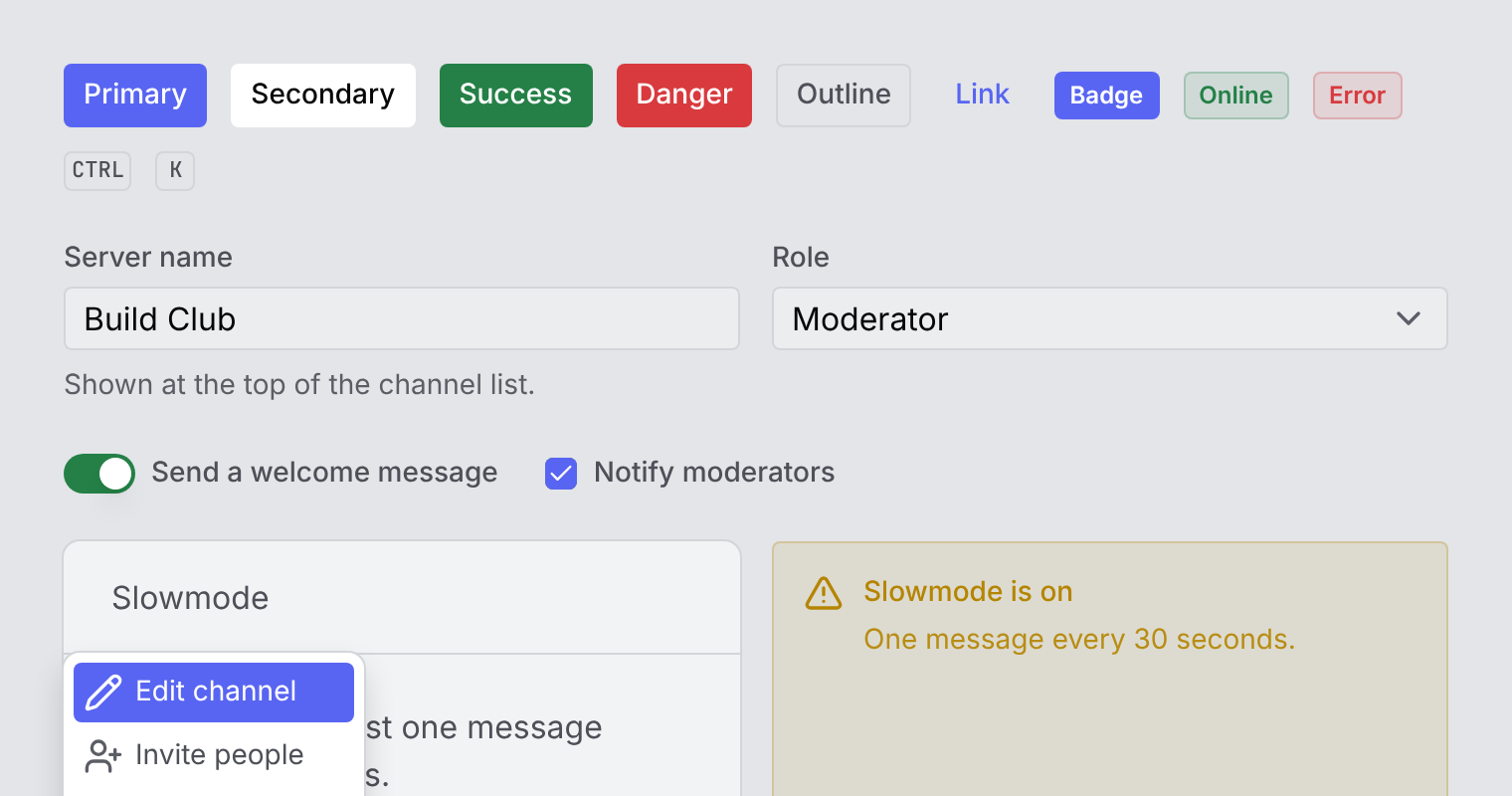
The light palette comes from the tokens too. With the colour mode set up as in
step three, Nuxt UI’s UColorModeButton switches both libraries at once.